The Logo
This is our master logo.
It’s modern, simple and eye catching. Everything about it says that UTMB is rock solid and here to stay.
Red is the color of warmth and humanity. It’s a true reflection of who we are – an organization that exists to bring better health to the world. It’s also a color that shows we’re alive, vibrant and continuing on our path toward a brighter future.
Our logo is bold, straightforward and free of adornment. It serves as a beacon to those we serve. Like the “utmb” in the red box, we are dynamic, pushing forward, always moving ahead.
Downloads
Using the Logo
Our preferred logo is the primary full color logo:
- The rectangle around the white "utmb" is UTMB Health Red.
- The word "Health" is UTMB Health Gray.
In cases where the background is too dark for the UTMB Health Gray to be used for the the word "Health", a reversed full color logo is used:
- The rectangle behind the white "utmb" is UTMB Health Red.
- The word "Health" is displayed in white.
- *
One-color (black and white) logos are also available.
White:
- The "utmb" text is black; the rectangle around it is white.
- The word "Health" is white.
Black:
- The "utmb" text is white; the rectangle around it is black.
- The word "Health" is black.
Please never alter the color combinations or allow "utmb" to be any color other than black or white; don't let a different background color "show through" the "utmb" portion of a transparent logo.
Please do not modify a "logo lockup." A lockup is the final form of a logo with all of its elements locked in their relative positions. For the sake of maintaining consistency in all mediums, the lockup should not be taken apart or modified in any way, other than resized proportionally.
If you need a custom version of the logo, please contact us.
"H" Space / Area of Isolation
The area of isolation is a buffer zone of neutral visual space that surrounds the logo to prevent visual interference from other graphic elements. Do not allow other graphic elements to penetrate this area.
The area of isolation equals the height of the H in "Health."
Sizing
To make sure the logo is clear and legible, there is a minimum size requirement. The minimum size is based on the width of the master logo.
The logo must be at least 1.5" wide in print and at least 108 pixels wide in on-screen uses. (Image in example is not to scale).
In certain applications, such as small giveaway items, the minimum size may be smaller. The smaller usage must be approved by the UTMB Health Brand Management Team.
Co-Branded Logo
When an application is co-branded with the UTMB Health logo and another logo, always place the UTMB Health logo on the left side and separate the logos with a vertical rule. The vertical rule is flush against the right edge of the UTMB Health logo’s area of isolation.
The secondary logo should be placed into the boxed area guide on the right side of the vertical rule, always flush against the left side of the boxed area. The height of the secondary logo should not exceed the height of the boxed area guide, and the length of the secondary logo should not exceed the length of the boxed area guide.
Background Colors and Photos
Whatever the background, be sure that the logo stands out and is easy to read.
The preferred background color for the full-color logo is white. The logo may also be used on a background color that is equal to a 20% value of black or lighter.
The full-color reversed logo may be used on a background that is black or on a color or photograph that is darker than an 80% value of black. The logo must stand out.
The logo may also be used on a photographic background, as long as the logo is still legible.
Examples of Correct Backgrounds:
Best Practices
Always use the logo as it was created and reproduce it using prepared digital art.
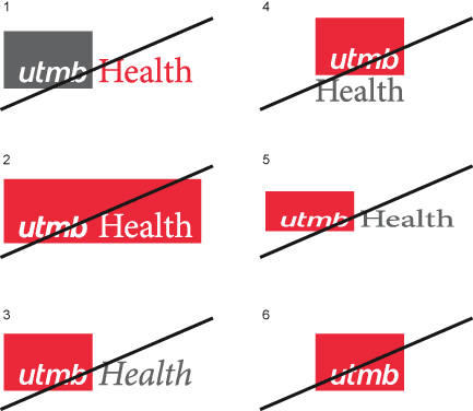
- Do not change the color assignment of the logo. (1, 2)
- Do not rearrange the logo’s configuration. (2, 4)
- Do not stretch or condense the logo. (5)
- Do not alter the logo in any way. (3, 6)
To obtain approved digital art of the logo, see Downloads area above.

Always use the correct logo for the background.
- Do not use the full-color logo on a color that is darker than a 20% value of black. (1, 2, 3)
- Do not use the logo on a color that makes it hard to see or read. (2, 3)
- Do not place the logo at the very edge of the background, respect the "H-space" area of isolation. (5)
- Do not use the full-color reversed logo on a color that is lighter than an 80% value of black. (6, 7)
- Do not use the logo on a busy photograph. (4, 9)
- Do not use the reversed logo on any background that makes it hard to see or read. (4, 8, 9)
- Do not use a solid color background behind "Health" different than the main background, blocking the word in. (10)
- Do not use the logo in a box over a background, instead, use the proper logo for the background color with a transparent background (.png file). (11)