Backgrounds
Carefully adding background colors and patterns to a web page can enhance its visual appeal and improve user experience when done thoughtfully.
Background colors and patterns should be added to a web page to enhance readability and focus by creating contrast between sections, making content easier to navigate. Patterns & gradients can subtly separate content areas without creating harsh visual breaks. Additionally, they can add visual interest and make a website more engaging, reflecting the brand's identity and evoking specific emotions.
Well-chosen colors and patterns can guide users' eyes to important content or call-to-action buttons, providing a more immersive and enjoyable experience. Consistent use of these elements reinforces brand recognition and conveys professionalism.
In Sitefinity
Within the Sitefinity Content Management System we’ve adopted a consistent use of the same brand color and pattern background options so as users are building the website content, there is a cohesive, recognizable brand-standard.
Background colors and patterns are applicable within the HTML view on any WYSIWYG Editor, on Content Block wrappers, on Layout Containers and most modules.
The Basics
Classes are available for brand color backgrounds, and gradient and patterned backgrounds to be used in conjunction with brand colors. With some basic CSS and HTML knowledge, users can also add background images and videos.
Best Practices
Best practices for adding background colors, patterns and images to webpages:
- Consider Accessibility: Ensure the text-to-background contrast is sufficient for readability and avoid overly busy patterns which can make text difficult to read.
- Use Subtle Patterns: Opt for low-contrast, subtle patterns and use them sparingly in specific sections with a minimal amount of text.
- Maintain Consistency: Use a consistent color scheme and pattern style aligned with overall design and branding throughout the site's webpages.
- Be Mindful of Load Times: Optimize images and patterns to avoid impacting page load times, using formats like SVG and WebP.
- Responsive Design: Ensure colors and patterns work well on all screen sizes and test on multiple devices.
- Context and Purpose: Choose colors and patterns that match the page's context and purpose, such as muted tones for professional sites and playful patterns for children's sites.
- Test User Feedback: Gather and act on user feedback to improve usability and satisfaction.
Color Backgrounds
All UTMB Brand colors are available in pre-written classes for use as a background color.
red-bg<div class="red-bg">
UTMB Red: #da1f12
</div>
gray-bg<div class="gray-bg">
UTMB Gray: #444444
</div>
gray-light-bg<div class="gray-light-bg">
Gray Light: #c9cac8
</div>
gray-mid-bg<div class="gray-mid-bg">
Gray Mid: #767676
</div>
gray-dark-bg<div class="gray-dark-bg">
Gray Dark: #111111
</div>
black-bg<div class="black-bg">
Black: #000000
</div>
blue-bg<div class="blue-bg">
Blue: #1b5196
</div>blue-light-bg<div class="blue-light-bg">
Blue Light: #c0e1ed
</div>blue-dark-bg<div class="blue-dark-bg">
Blue Dark: #1c3a56
</div>teal-bg<div class="teal-bg">
Teal: #457A82
</div>teal-light-bg<div class="teal-light-bg">
Teal Light: #c4e1de
</div>teal-dark-bg<div class="teal-dark-bg">
Teal Dark: #005760
</div>orange-bg<div class="orange-bg">
Orange: #eba149
</div>orange-light-bg<div class="orange-light-bg">
Orange Light: #f5d7a5
</div>orange-dark-bg<div class="orange-dark-bg">
Orange Dark: #bf5700
</div>green-bg<div class="green-bg">
Green: #626e25
</div>
green-light-bg<div class="green-light-bg">
Green Light: #c2ca95
</div>green-dark-bg<div class="green-dark-bg">
Green Dark: #414823
</div>white-bg<div class="white-bg">
White: #ffffff
</div>
gray-1-bg<div class="gray-1-bg">
Gray 1: #111111
</div>
gray-2-bg<div class="gray-2-bg">
Gray 2: #222222
</div>
gray-3-bg<div class="gray-3-bg">
Gray 3: #333333
</div>
gray-4-bg<div class="gray-4-bg">
Gray 4: #444444
</div>
gray-5-bg<div class="gray-5-bg">
Gray 5: #555555
</div>
gray-6-bg<div class="gray-6-bg">
Gray 6: #666666
</div>
gray-7-bg<div class="gray-7-bg">
Gray 7: #777777
</div>
gray-8-bg<div class="gray-8-bg">
Gray 8: #888888
</div>
gray-9-bg<div class="gray-9-bg">
Gray 9: #999999
</div>
gray-a-bg<div class="gray-a-bg">
Gray A: #aaaaaa
</div>
gray-b-bg<div class="gray-b-bg">
Gray B: #bbbbbb
</div>
gray-c-bg<div class="gray-c-bg">
Gray C: #cccccc
</div>
gray-d-bg<div class="gray-d-bg">
Gray D: #dddddd
</div>
gray-e-bg<div class="gray-e-bg">
Gray E: #eeeeee
</div>
Gradient Backgrounds
Background color gradient extension classes are leveraged by stacking along with a UTMB background color class. This combination makes for a really nice effect on large blocks elements. When using any gradient be sure to test any overlaying text colors on the darkest and lightest part of the gradient to make sure the color contrast passes accessibility tests.
bg-gradiant<div class="red-bg bg-gradiant">
Example Using: .red-bg
</div>
bg-gradiant-horizontal<div class="red-bg bg-gradiant-horizontal">
Example Using: .red-bg
</div>
bg-gradiant-diagonal<div class="red-bg bg-gradiant-diagonal">
Example Using: .red-bg
</div>
bg-gradiant-bright<div class="red-bg bg-gradiant-bright">
Example Using: .red-bg
</div>
bg-gradiant-bright-horizontal<div class="red-bg bg-gradiant-bright-horizontal">
Example Using: .red-bg
</div>
bg-gradiant-bright-diagonal<div class="red-bg bg-gradiant-bright-diagonal">
Example Using: .red-bg
</div>
Pattern Backgrounds
Background color pattern extension classes are leveraged by stacking along with a UTMB background color class. When using any pattern be sure to test any overlaying text colors on the darkest and lightest part of the gradient to make sure the color contrast passes accessibility tests. Patterns are best used on large blocks elements with the overlaying text added to a solid color color background or card.
bg-pattern-topo-white<div class="teal-bg bg-pattern-topo-white">
<div class="utmb-card-small">Example Using: .bg-teal .bg-pattern-topo-white</div>
</div>bg-pattern-topo-teal<div class="bg-pattern-topo-teal">
<div class="utmb-card-small">Example Using: .bg-pattern-topo-teal</div>
</div>bg-pattern-topo-teal-light<div class="teal-dark-bg bg-pattern-topo-teal-light">
<div class="utmb-card-small">Example Using: .teal-dark-bg .bg-pattern-topo-teal-light</div>
</div>bg-pattern-topo-teal-dark<div class="bg-pattern-topo-teal-dark">
<div class="utmb-card-small">Example Using: .bg-pattern-topo-teal-dark</div>
</div>bg-pattern-topo-blue<div class="bg-pattern-topo-blue">
<div class="utmb-card-small">Example Using: .bg-pattern-topo-blue</div>
</div><div class="blue-dark-bg bg-pattern-topo-blue-light">
<div class="utmb-card-small">Example Using: .blue-dark-bg .bg-pattern-topo-blue-light</div>
</div>bg-pattern-topo-blue-dark<div class="bg-pattern-topo-blue-dark">
<div class="utmb-card-small">Example Using: .bg-pattern-topo-blue-dark</div>
</div>bg-pattern-topo-gray<div class="bg-pattern-topo-gray">
<div class="utmb-card-small">Example Using: .bg-pattern-topo-gray</div>
</div>bg-pattern-topo-gray-light<div class="bg-pattern-topo-gray-light">
<div class="utmb-card-small">Example Using: .bg-pattern-topo-gray-light</div>
</div>bg-pattern-topo-gray-dark<div class="bg-pattern-topo-gray-dark">
<div class="utmb-card-small">Example Using: .bg-pattern-topo-gray-dark</div>
</div>Training
Adding Background Color, Gradients or Patterns to Widgets
-
Adding a background color to a layout element
- In the edit view of the page, click edit on the layout element.
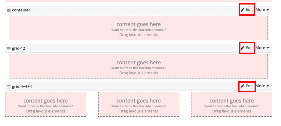
- Under the Classes tab, add the desired background CSS classes in the row, column, or container fields. Leave any predefined classes that
are automatically generated. Multiple CSS classes can be added but must be separated by a space.
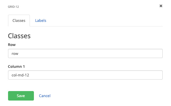
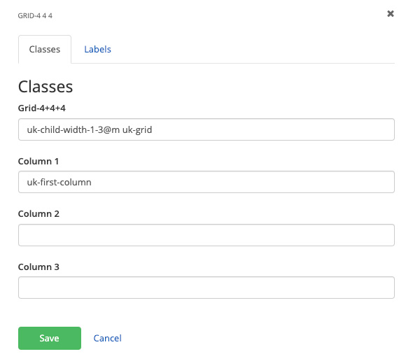
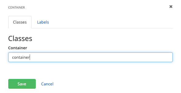
- Click the Save button.
- In the edit view of the page, click edit on the layout element.
-
Adding a background color to a content block
- In the edit view of the page, click edit on the content block.

- Click the advance settings gear icon in the top-right of the content block
- Under the Classes tab, add the desired background CSS classes to the Wrapper CSS class field. Multiple CSS classes can be added but must be separated by a space.
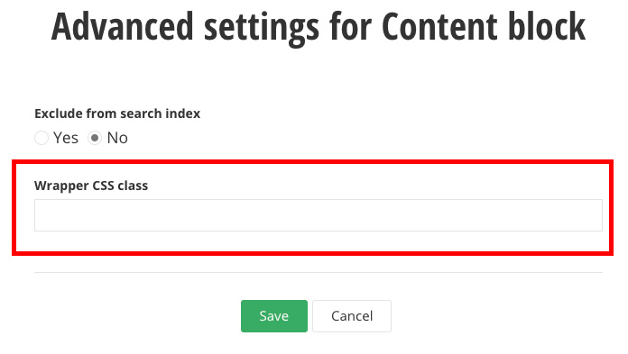
- Click the Save button and then click Save again on the content block.
- In the edit view of the page, click edit on the content block.